Creators Hub Shipped & live Desktop, mobile, two themes

A content agency that had to look produced

Video, design and social production for Infinix, Boubyan, Gamestore and the Egyptian Esports Federation. A content agency is judged on the same axis as its work: if the site doesn't look produced, nothing else it says matters.
Open creatorshub.studio

My roleDesigned the site end to end, both themes
StatusShipped, live
Clients shownInfinix · Boubyan · Gamestore · Egyptian Esports Federation
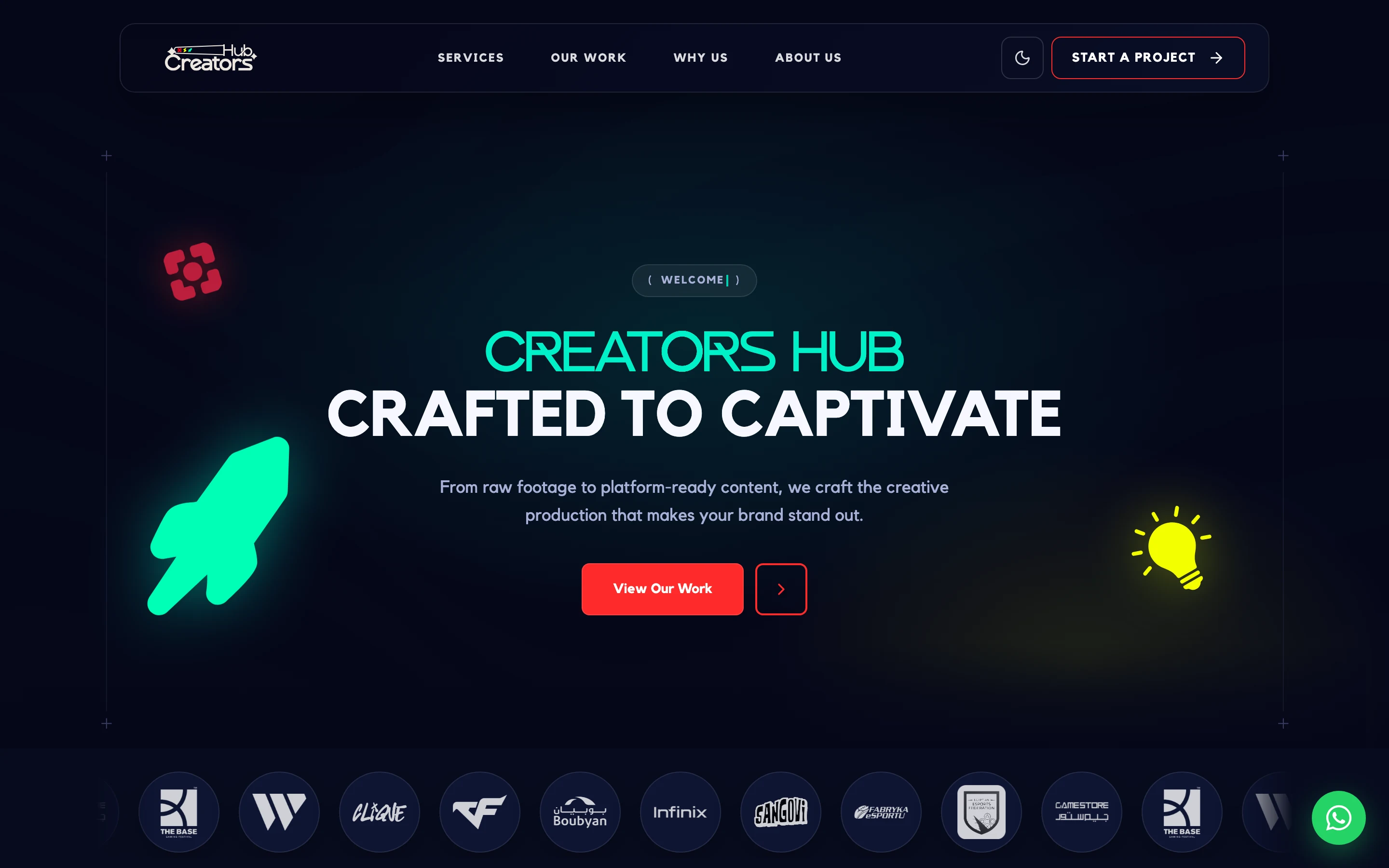
Creators Hub in dark: a neon green wordmark over a deep navy field, a rocket and lightbulb motif, a red call to action, and a row of client logos.
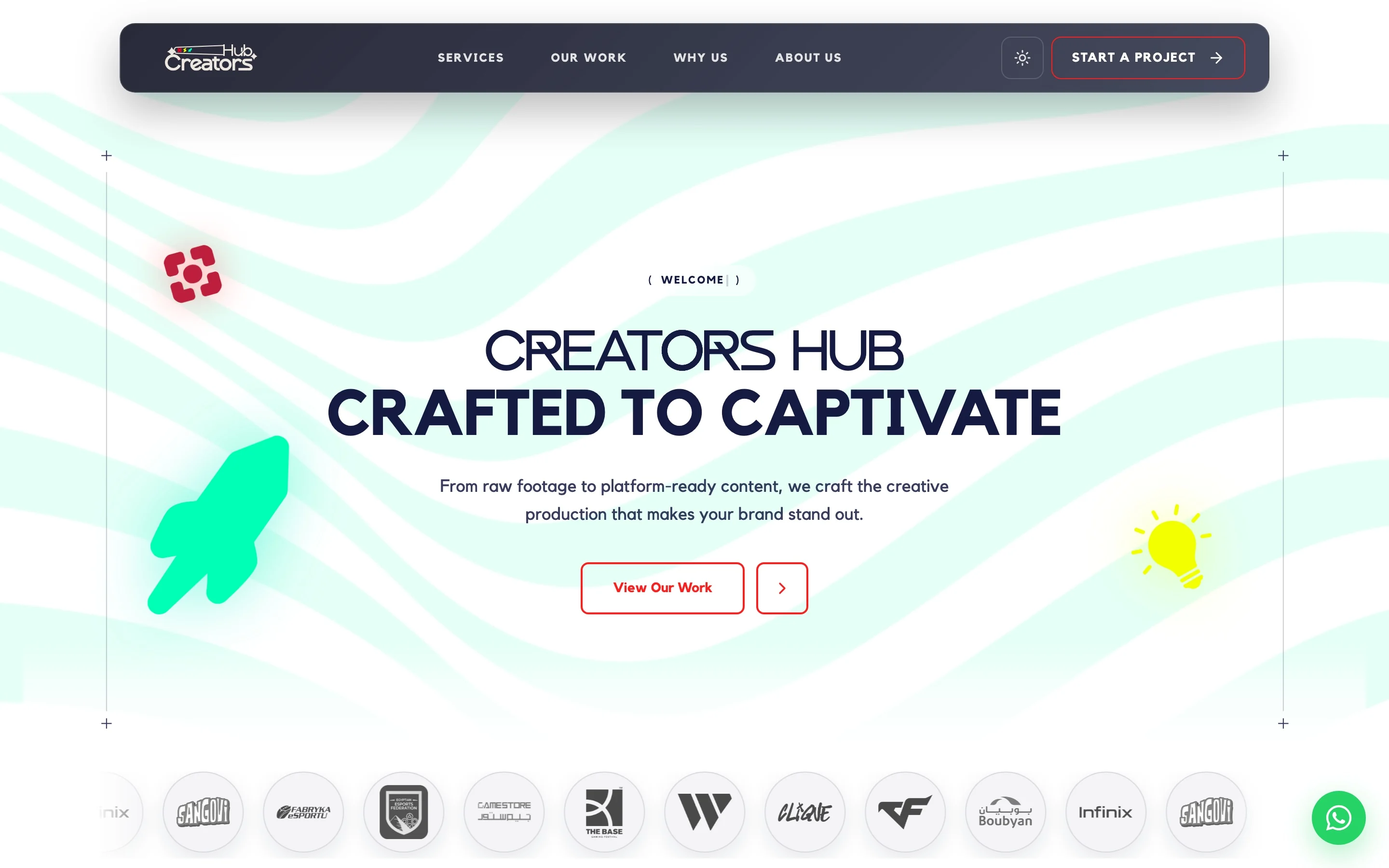
The same Creators Hub hero in light: the identical layout on a pale ground with the accents re-weighted.

The hero. Client logos sit directly under the headline rather than in a trust bar three screens down. Shown in both themes: Not an inverted palette. On dark the wordmark glows mint and the ground is flat; on light the ground grows a mint wave pattern and the wordmark drops to navy, because a glow on white is just a smudge. The red action is outlined in one and filled in the other so it holds the same weight in both.

The problem

The client list runs from a bank to an esports federation, so the personality had to be strong enough to be memorable and neutral enough not to fight the logos sitting on it. And most of the traffic arrives on a phone, from a link in a bio - so the mobile layout is the real design, not a reduction of the desktop one.

What I decided

  • Lead with the client wall. Infinix and a national esports federation do more persuading in one row than a page of copy.
  • Ship both themes as first-class. Mint is the wordmark on dark and the background texture on light - same hue, different job, neither one an afterthought.
  • Put every client logo on a neutral chip - navy on dark, white on light. A bank's mark and a gaming festival's mark need the same ground or one of them always looks wrong.
  • Motion carries the "we make video" claim - the hero animates rather than describing itself.

The trade-off

Two themes doubles the surface area to keep consistent, and it is the first thing that rots when someone adds a section in a hurry. I took it because the switch is itself a demonstration - an agency that can't hold its own system together twice is not a convincing argument for hiring it.

On a phone, where most of the traffic lands

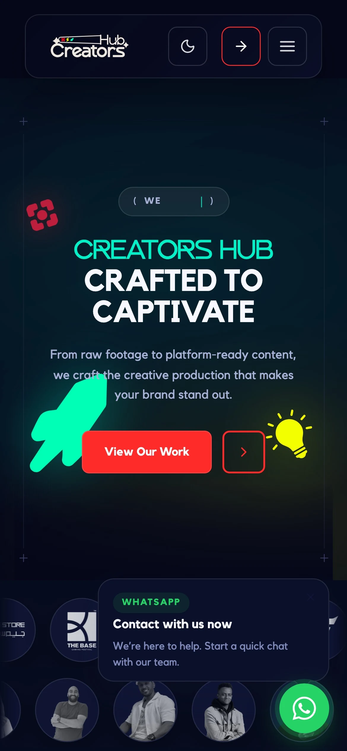
Hero
Creators Hub on mobile: the wordmark, headline and call to action stacked, with the client logos below.
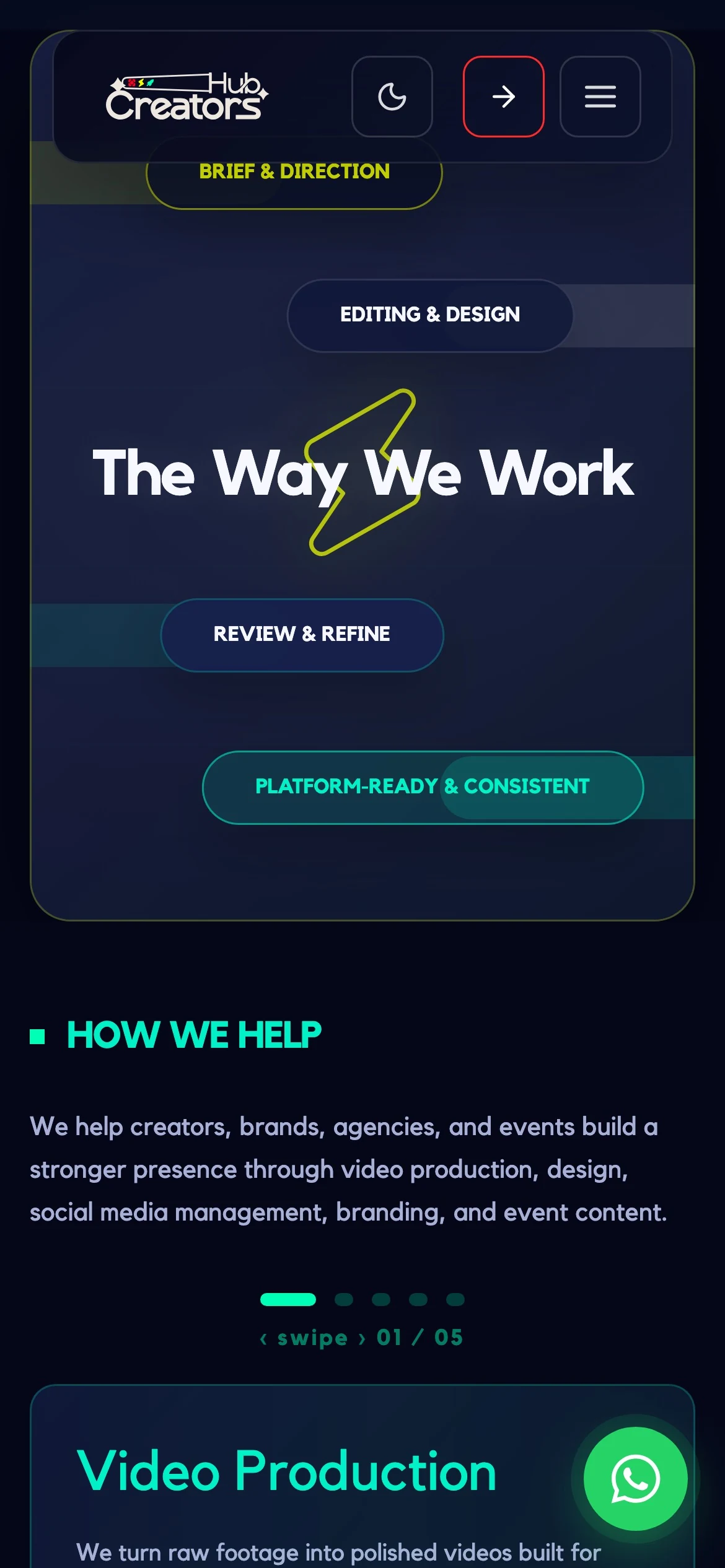
The way we work
Creators Hub on mobile: the four-stage process laid out vertically over a lightning motif.
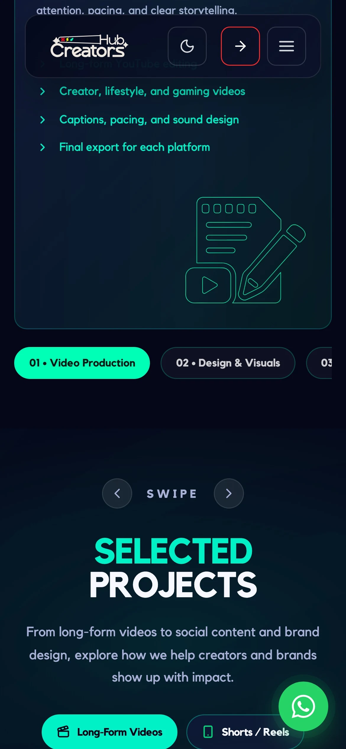
Services
Creators Hub on mobile: the services carousel with a swipe indicator and card counter.

Mobile is the real layout. Most visitors arrive from a link in a bio, so the phone version isn't a reduction - the four-stage process becomes a vertical run, and the services turn into a swipe deck with a visible counter so nobody misses that there are five.

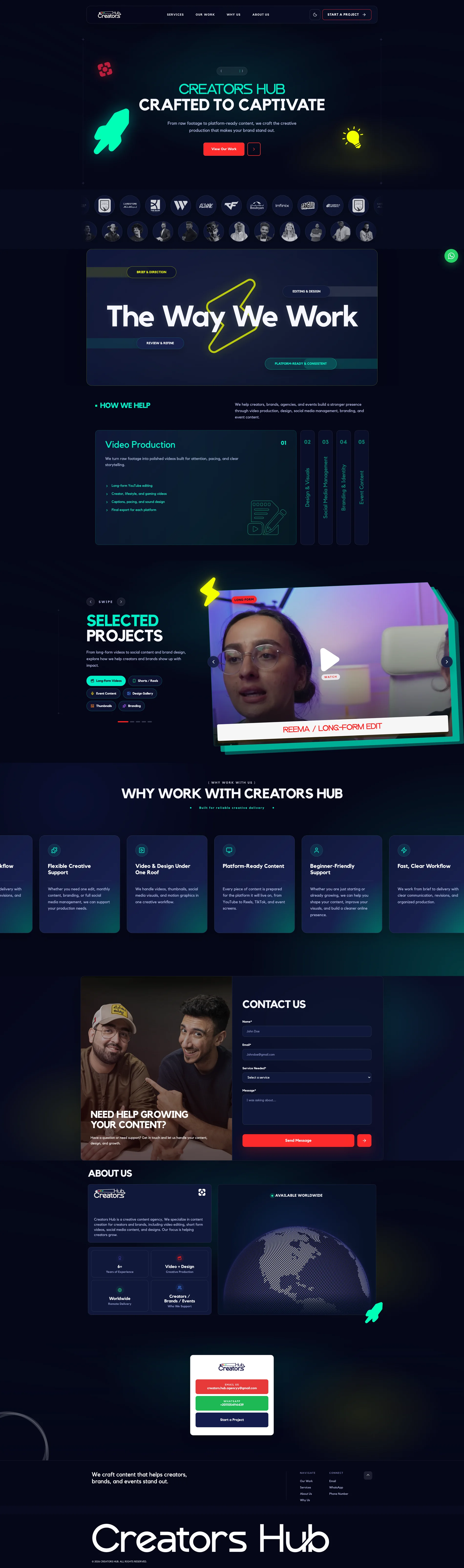
creatorshub.studio - darkscroll ↓
The whole Creators Hub page in dark, top to bottom: hero, client wall, the way we work, services, selected projects, testimonials, about and contact.

Dark, the whole page. Hero, client wall, the four-stage process, services and selected projects - the default theme, and the one the brand was drawn for.

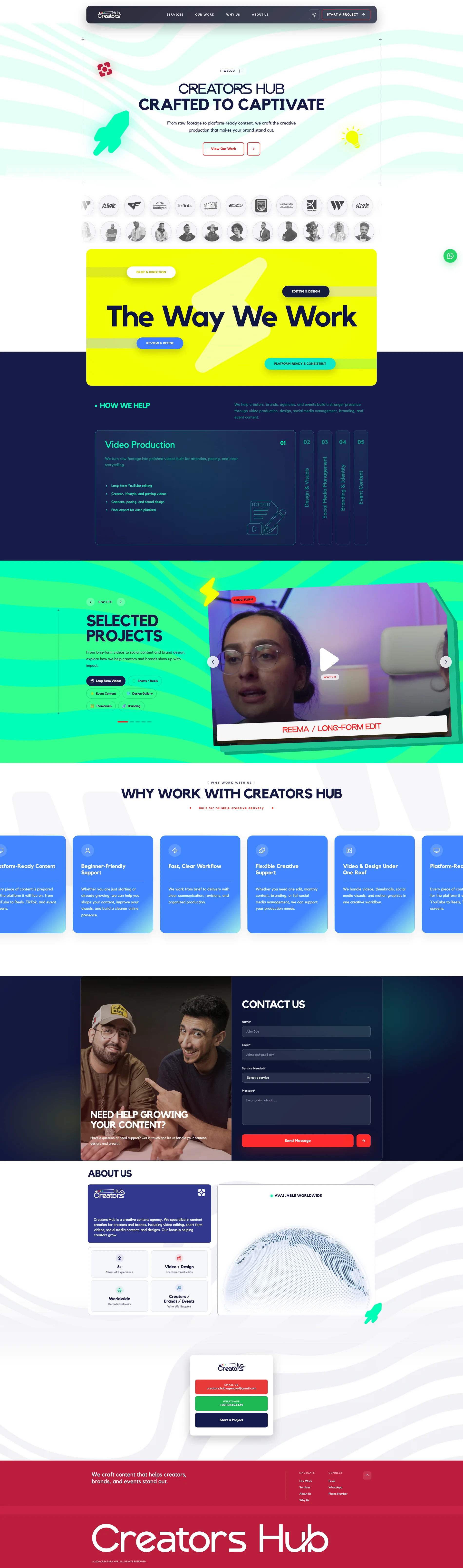
creatorshub.studio - lightscroll ↓
The same full Creators Hub page in light, section for section, top to bottom.

Light, the same page. Section for section, same rhythm - and note what does not flip: the process band goes yellow, but the services block stays navy in both, because that panel's contrast was already doing its job.