Selected earlier work
A collection of work across public health, ecommerce, careers, logistics, esports and consulting.
 Web
Web
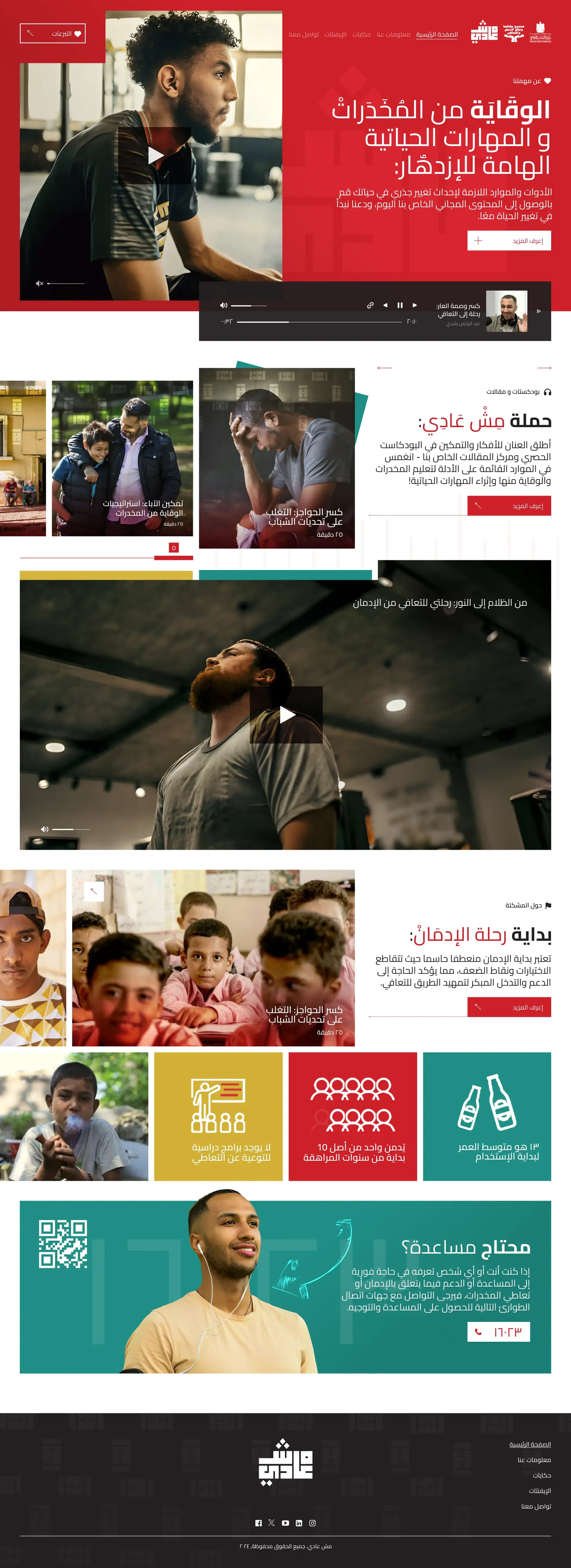
A public-health site for three very different audiences
A national addiction-prevention platform for teenagers, parents and people looking for help, with the 16023 helpline reachable throughout the page.
 Ecommerce · Web
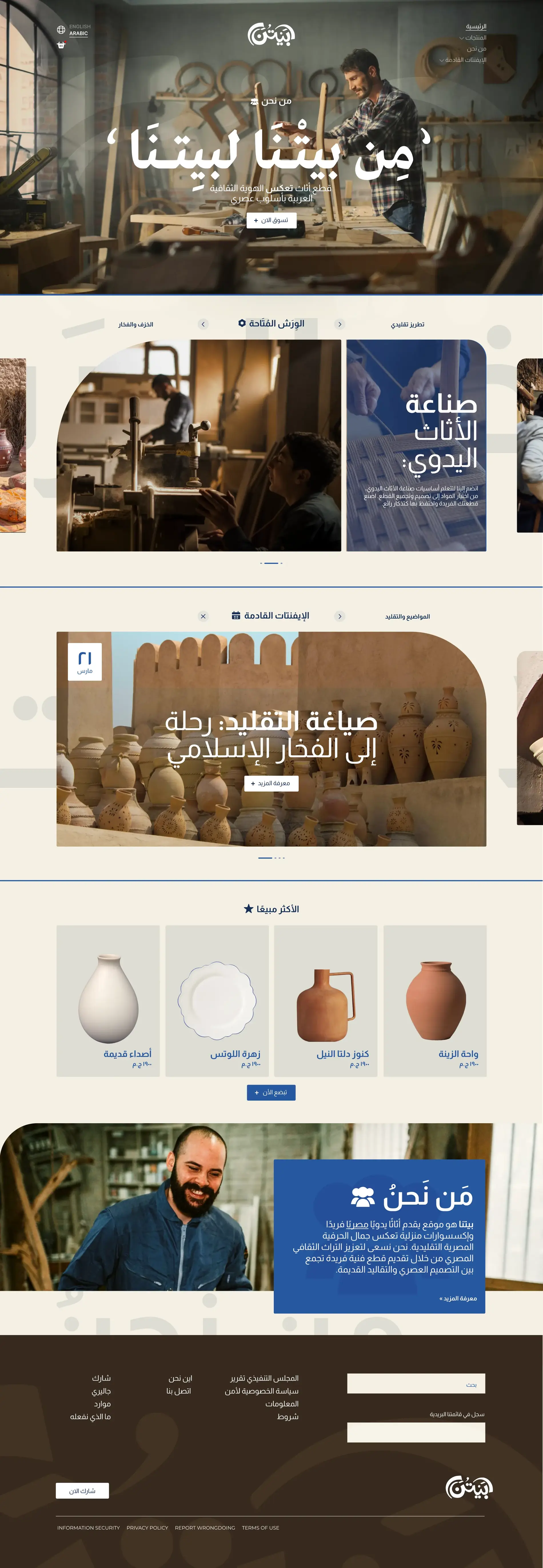
Handmade furniture, workshops and events in one place
A marketplace for handmade Egyptian furniture, bringing products, workshops and events into the same experience.
 Ecommerce · Web
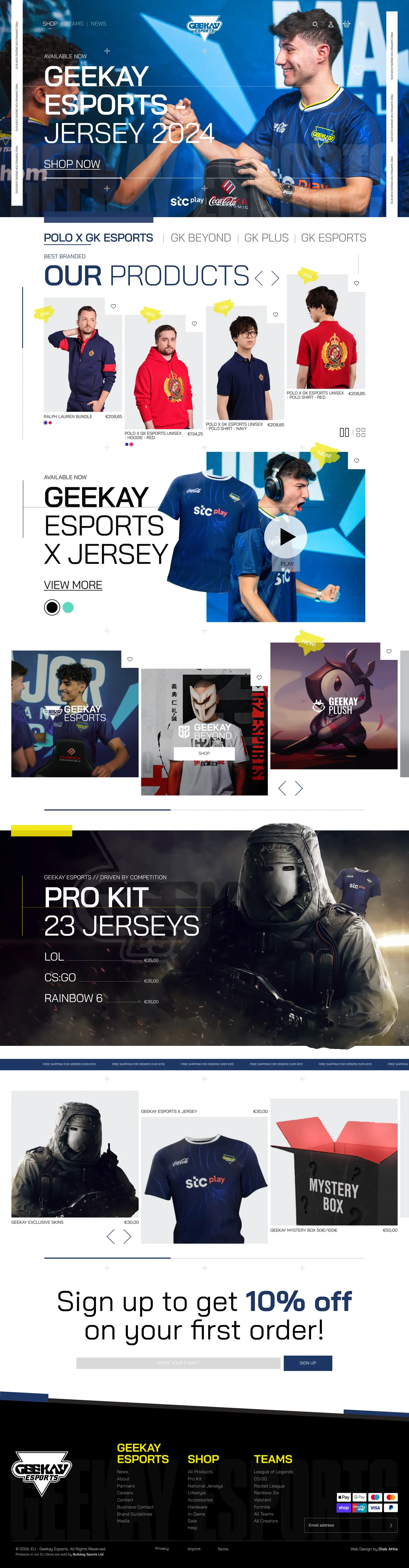
A store built for a large esports catalogue
An ecommerce site for Geekay Esports, with product cards, carousels and promotion rules designed to work across a large catalogue.
 Branding · Web
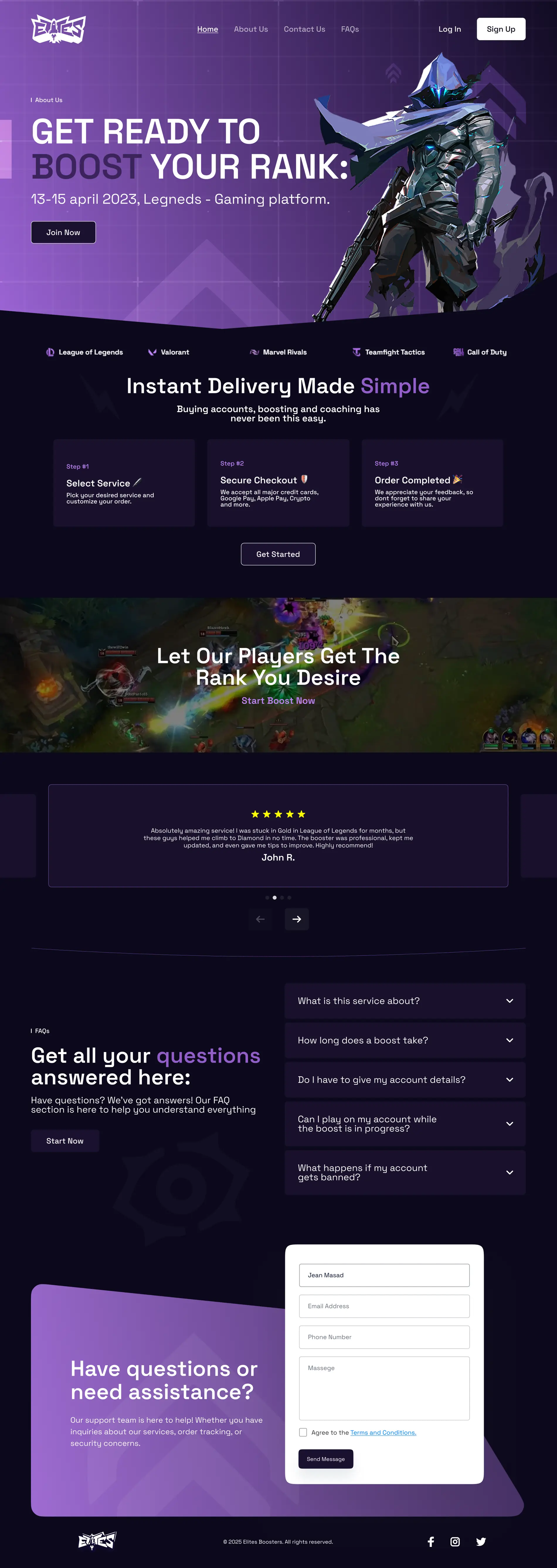
A game-boosting service built around trust
A game-boosting and coaching service structured around the main questions people have before buying: how it works, account safety and whether they can keep playing.

 Branding · Web
What happens after the form
A performance marketing site with a follow-up experience showing people what happens after they submit.
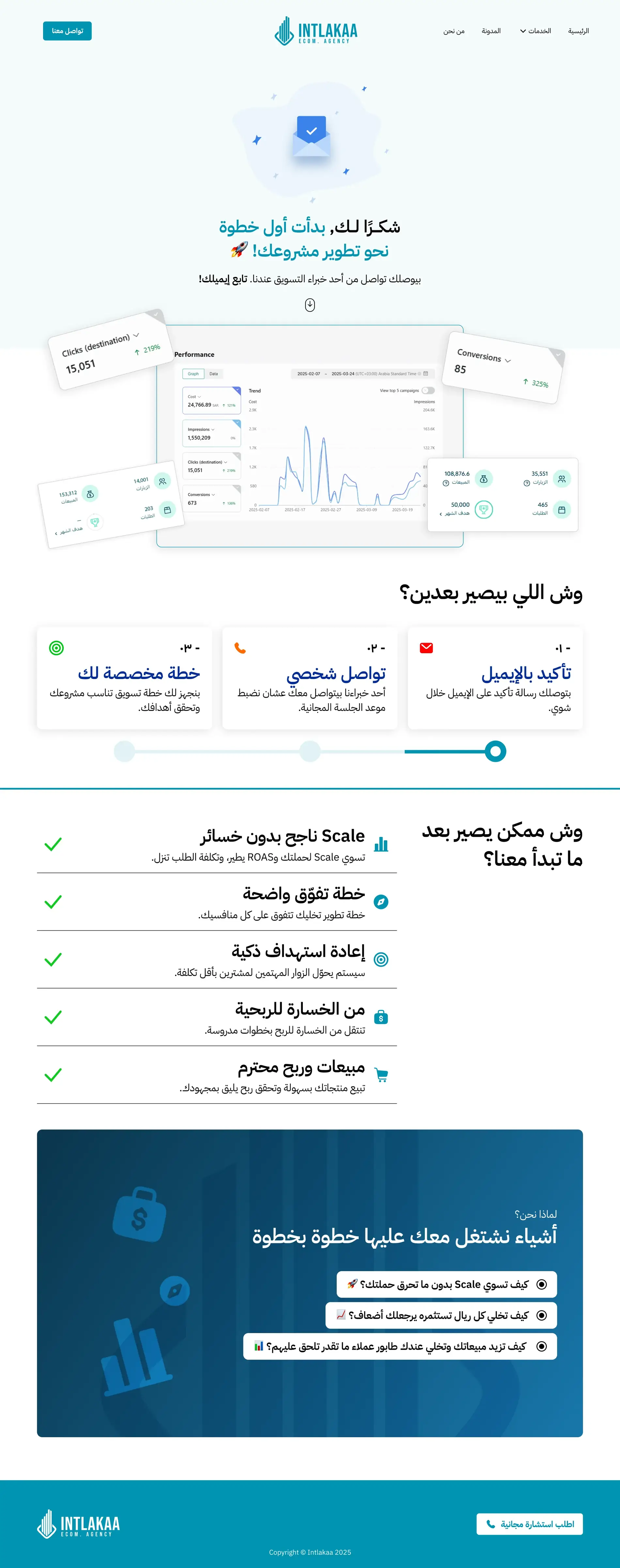
After the form
A three-step tracker showing who will call, when and what to have ready.
 Product · Branding
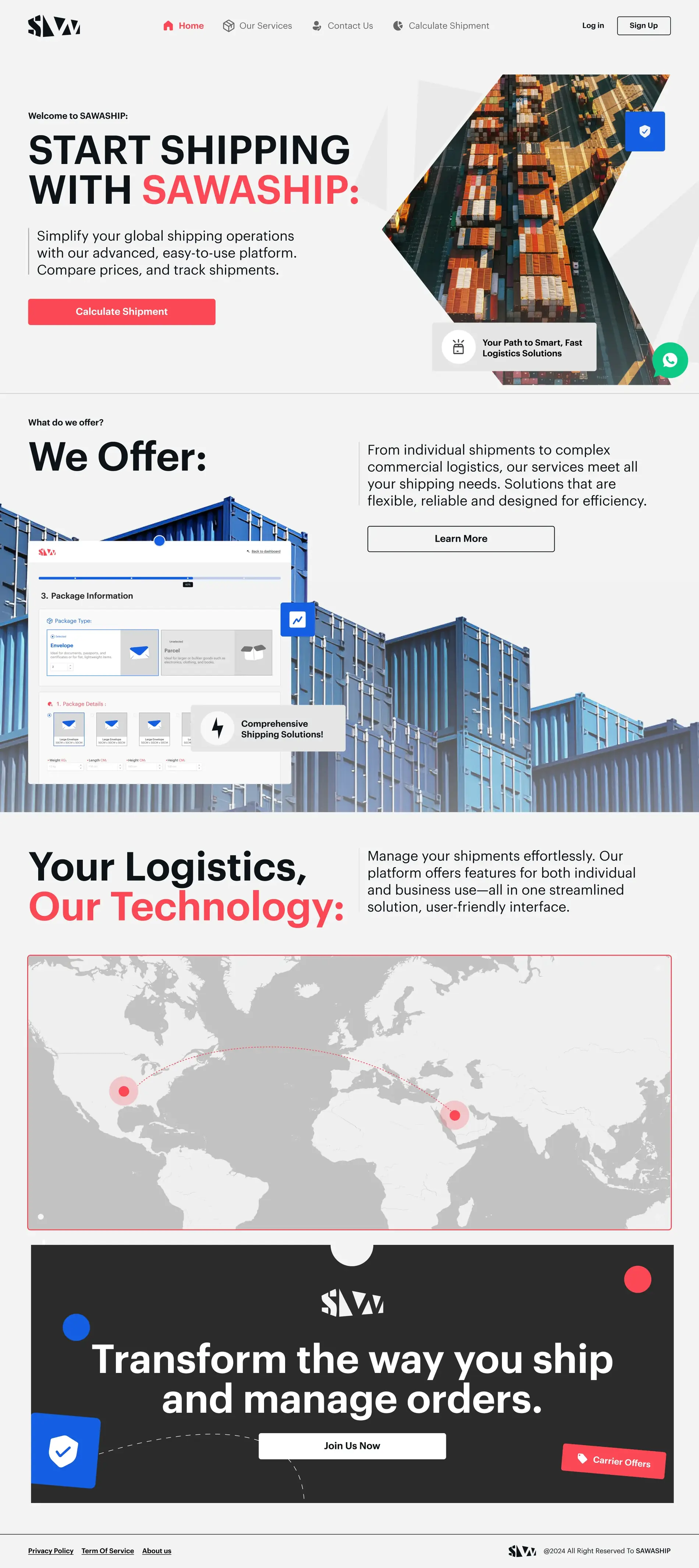
Shipping comparison and tracking
A shipping platform with a multi-step quote flow for selecting a service, adding quantities and entering shipment dimensions.
 Product · Web
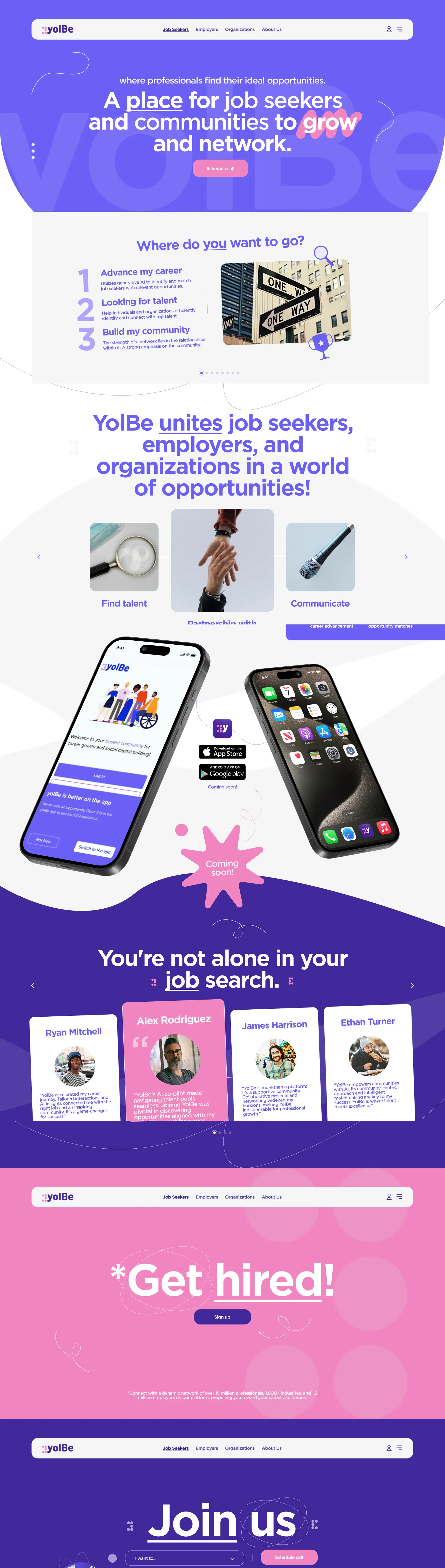
Three audiences, one platform
An AI-assisted careers platform for job seekers, employers and organisations, keeping all three audiences inside one experience.
 Web
Web
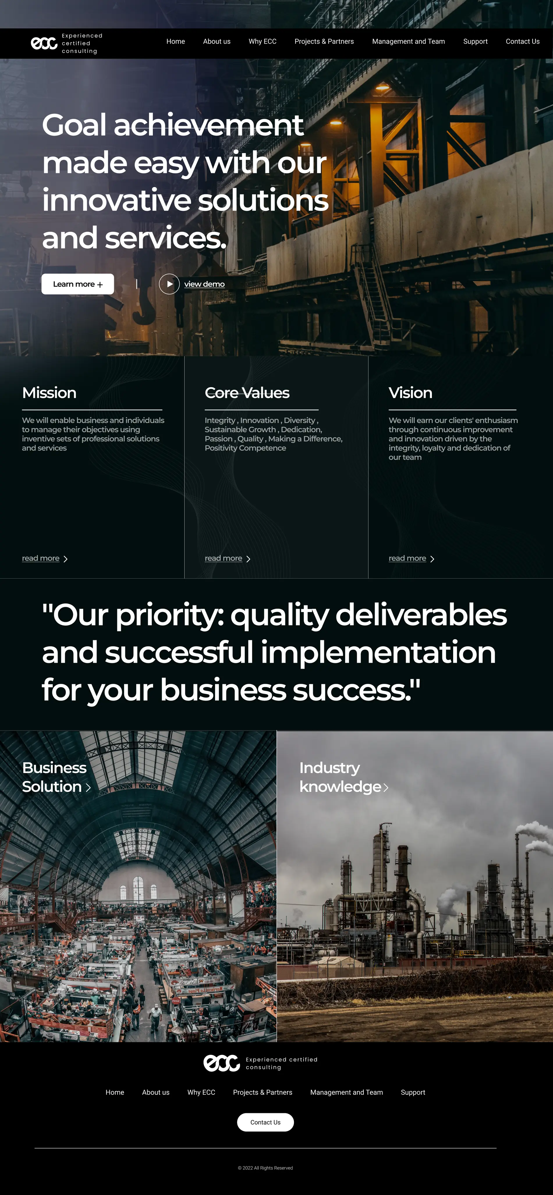
A corporate site carried by photography
A corporate consulting site kept almost monochrome, using industrial photography as the main source of colour and character.
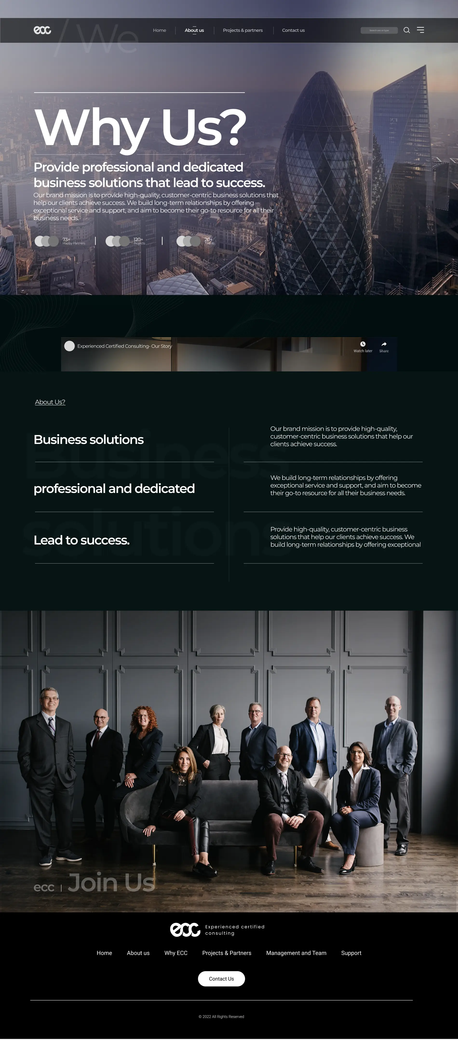
Why us
The same visual system carried into an interior page using full-width photography, dark sections and oversized type.
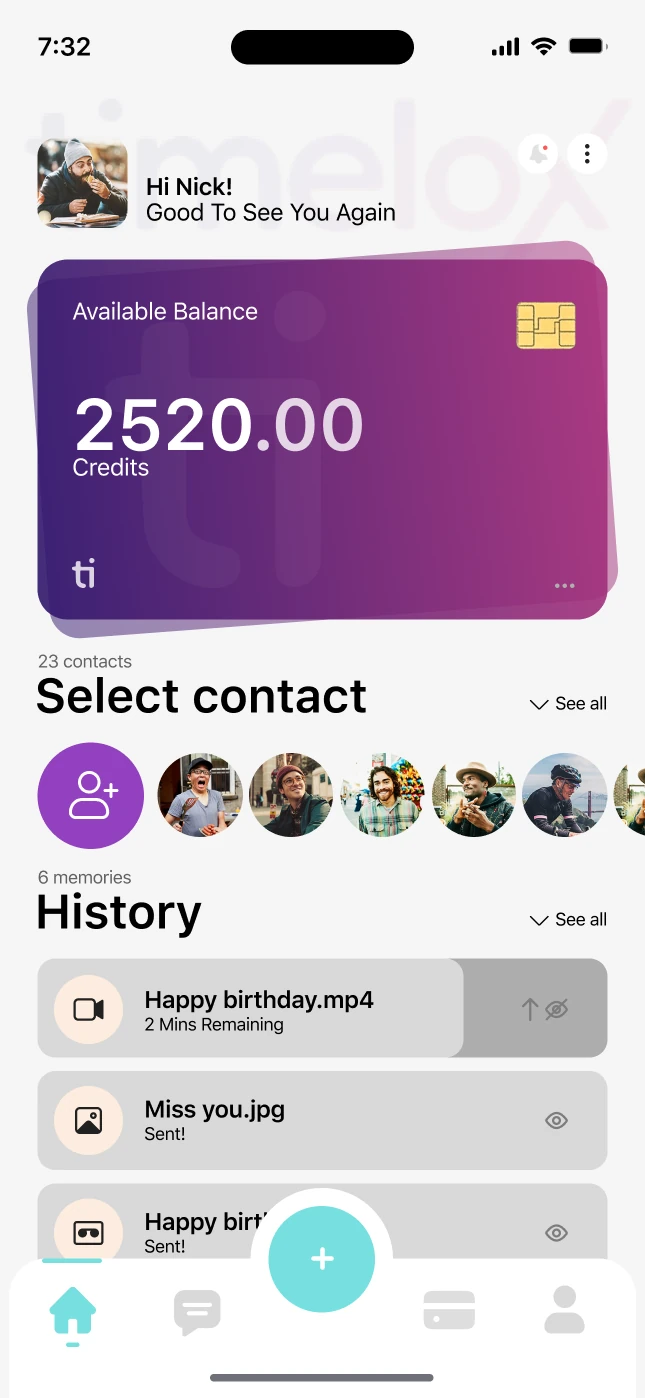
Timelox
A time-locked messaging app with a credits wallet.