Sustainability consulting, made legible
Masader advises banks, industry and governments across MENA on ESG and climate. Eight service lines, eleven accreditations and twenty-two sectors had to fit on one page without becoming a directory.
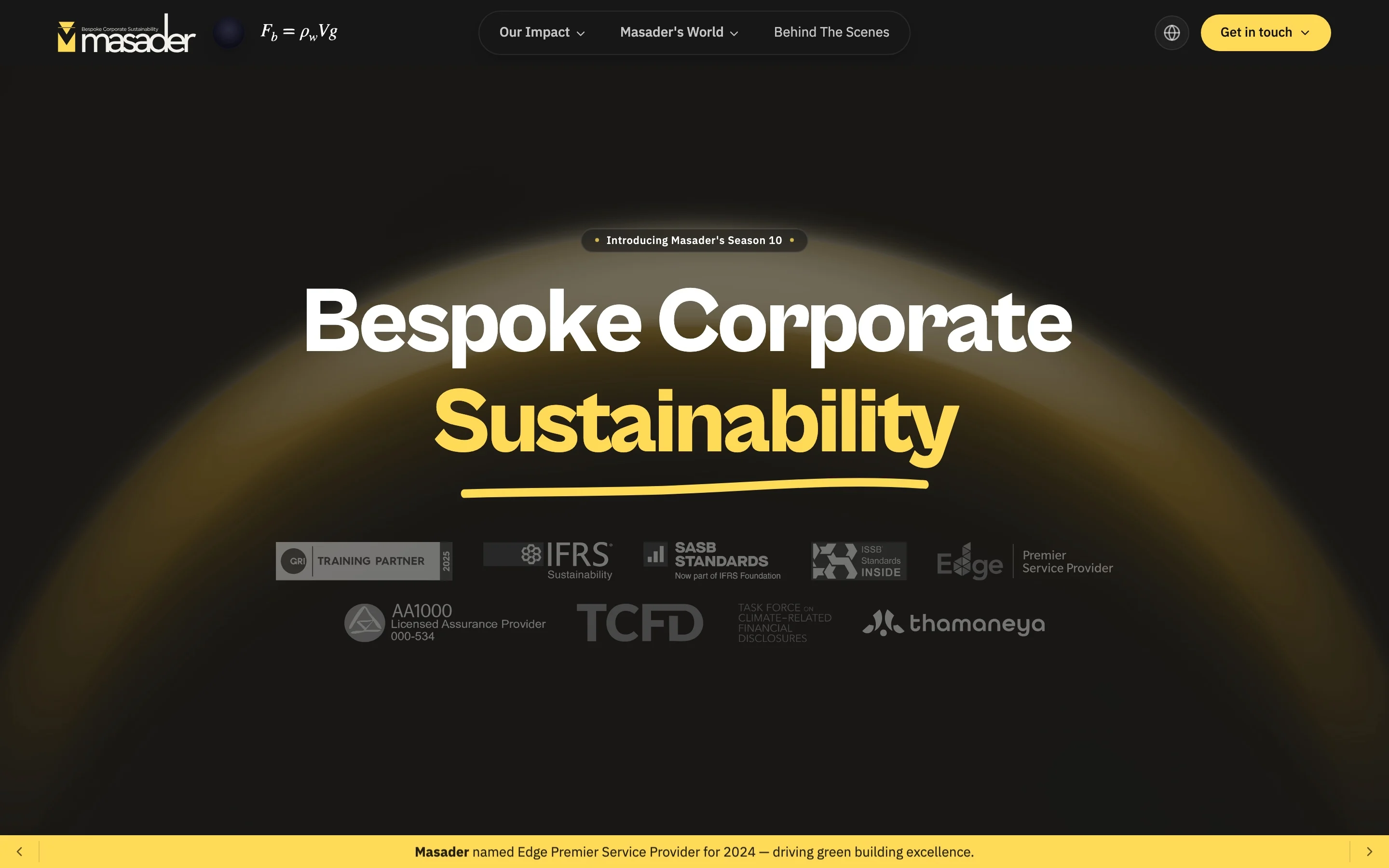
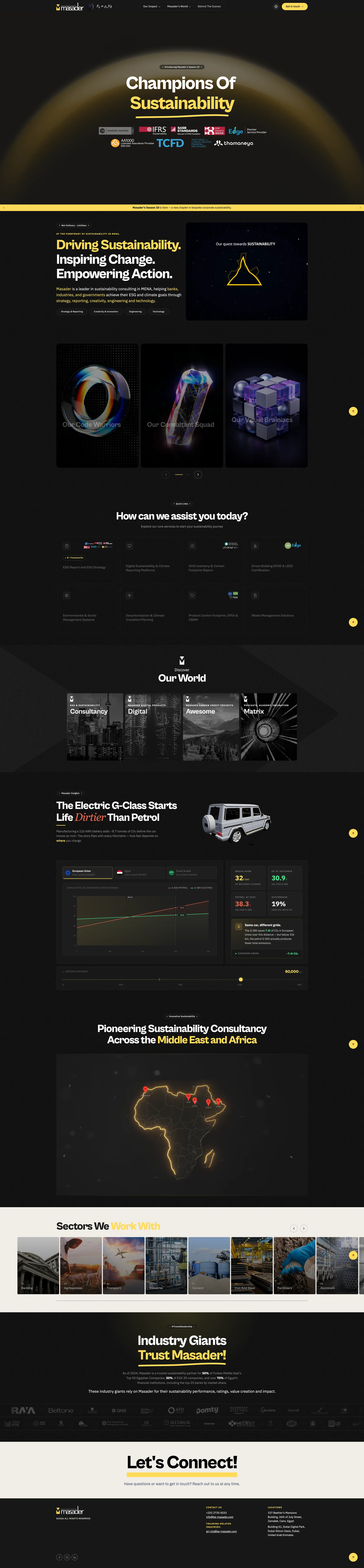
Proof before claims. GRI, IFRS, SASB, ISSB, EDGE, AA1000 and TCFD sit directly under the first headline. In this category the licence is the pitch, and a visitor deciding whether to keep reading is deciding whether these people are credentialled.
3D interactive element
It moves. The car turns a slow full circle while you read - the one piece of motion on a page that is otherwise very still, placed exactly where the argument starts.

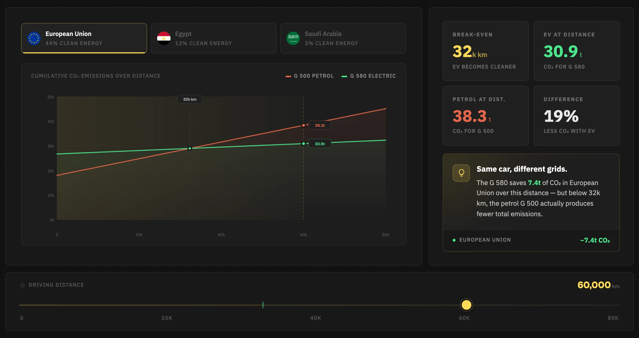
And you operate it. Pick a grid - EU 44% clean, Egypt 12%, Saudi 3% - then drag the distance and watch the break-even move. It lands at 32,000 km. A reader who finds the number themselves argues with it less.
The problem
An ESG consultancy has to convince two people at once: a sustainability officer who wants rigour, and a CFO who wants to know why this is a cost worth carrying. The previous site listed services. Listing services persuades neither.
What I decided
- Lead with proof, not claims. The accreditation marks sit directly under the first headline, because in this category the licence is the pitch.
- One accent colour for the whole site. Everything else earns attention through scale and space - with twenty-two sectors on the page, a second colour would have flattened the hierarchy into noise.
- Make the insight section something you operate rather than read. It is the only place on the page where the visitor does work, and it is the part they repeat back.
- Bilingual English and Arabic with real RTL, not a translation layer bolted on afterwards.
The trade-off
The near-monochrome dark treatment makes the accreditation logos harder to read than a white background would - several are supplied dark-on-transparent. I took the hit because the brand only holds together dark, and rebuilt the logo row as a lightened panel rather than asking eleven organisations for new artwork.

The whole page. Sequenced so a first-time visitor reaches a service before they reach a claim, and a returning one can jump straight to the sector that is theirs.

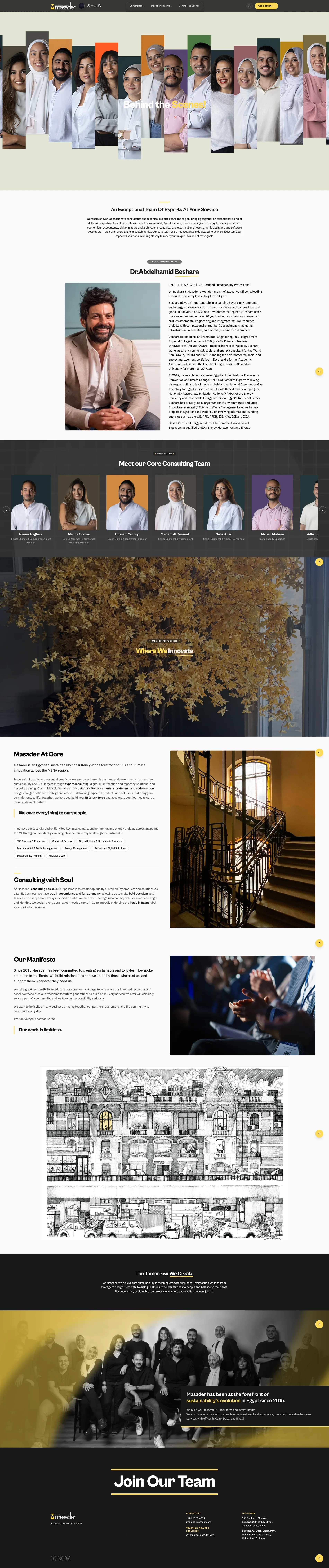
Behind the Scenes. A consultancy sells people, so the about page leads with thirty of them in a single mosaic rather than a paragraph about values. Each portrait sits in its own colour panel - the one place in the system where the palette opens up.

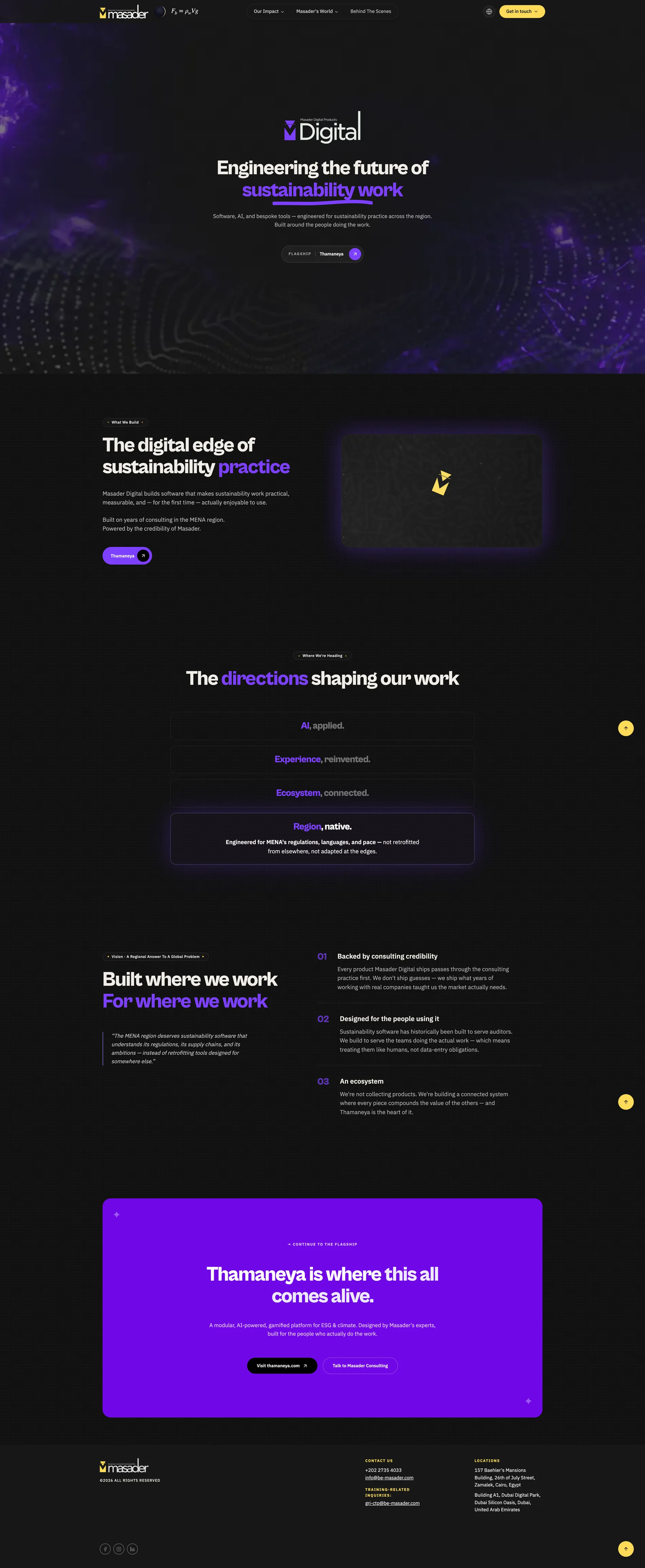
Masader Digital. The software arm - climate and ESG reporting platforms - needed its own page without forking the brand. Same tokens, same one accent, different density: this page is for buyers comparing tools, so it gets specifics where the home page gets scale.