Browse to paid ticket, in Arabic
A cultural and literary events app for Saudi Arabia. Fourteen screens across two flows - attending an event, and creating one.
Attending an event


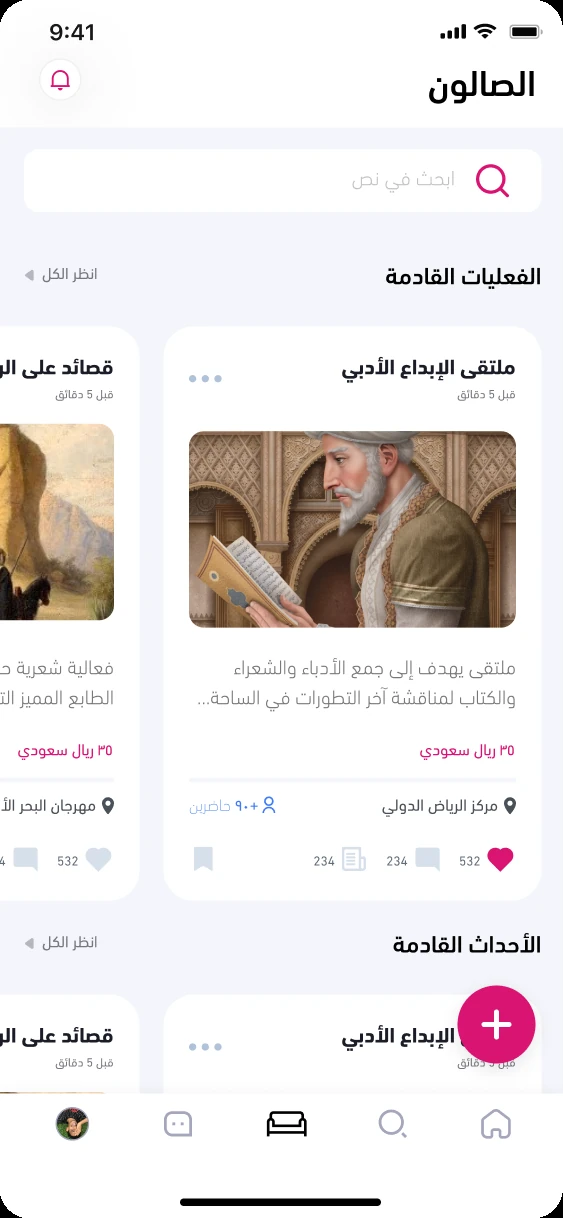
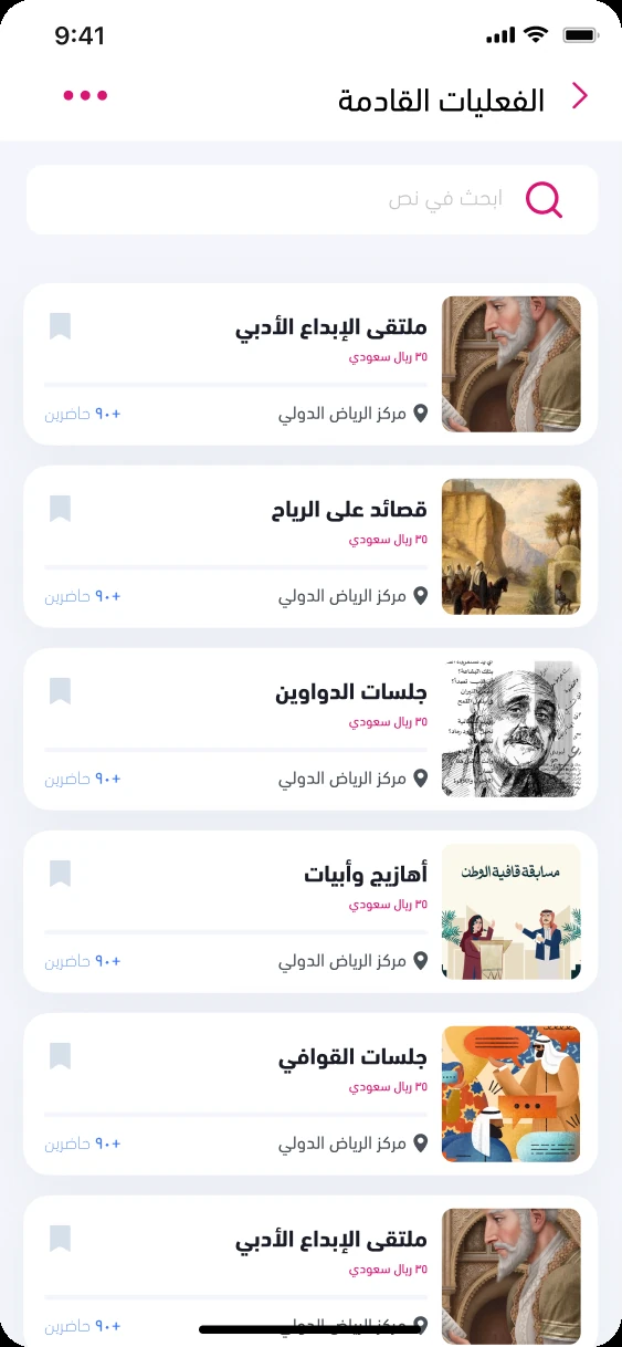
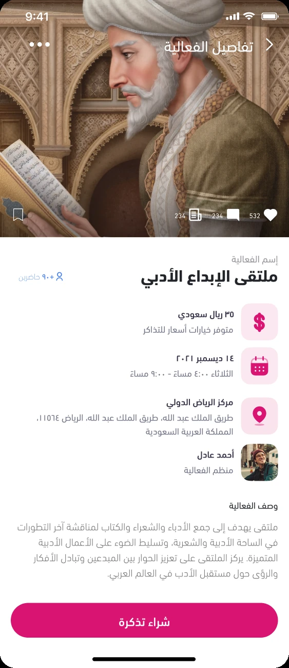
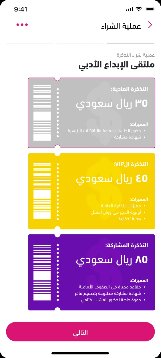
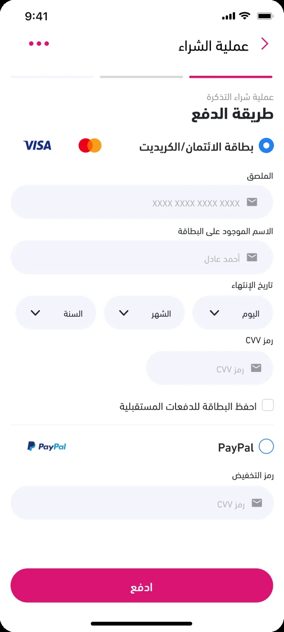
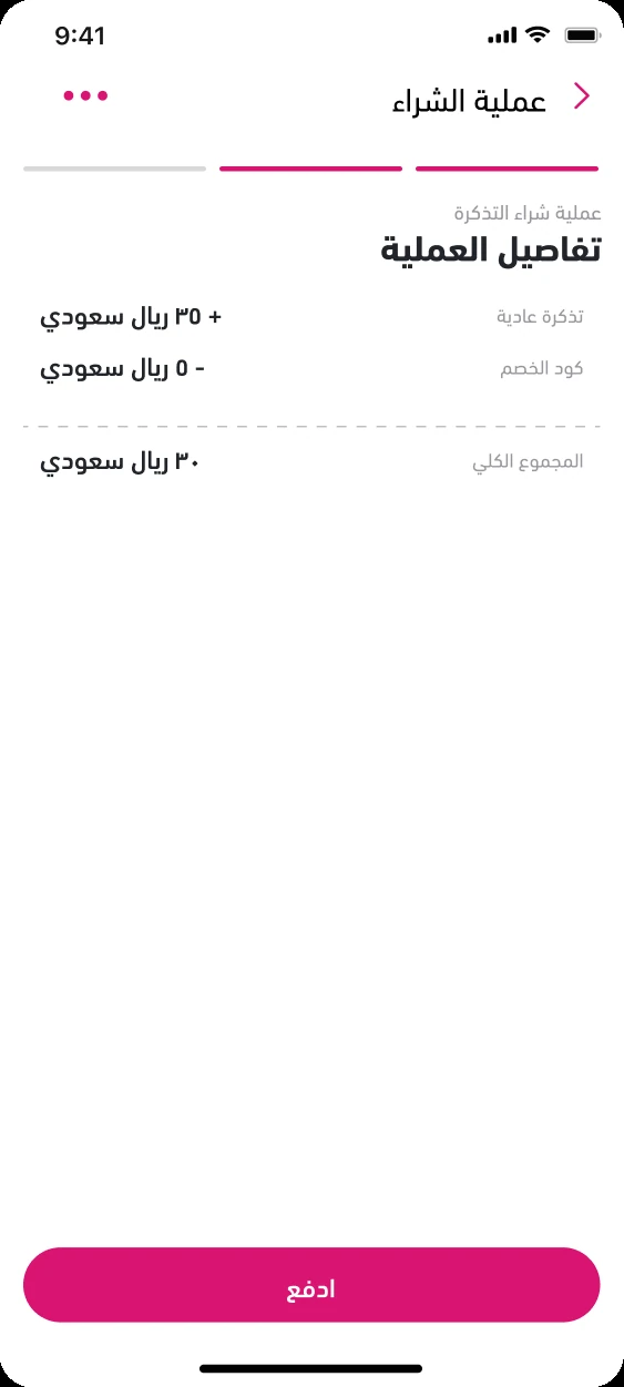
Browse → detail → tier → pay. The list and the detail share one card anatomy, so what you tapped is recognisably what you land on. Tiers are a comparison, not a menu - three tickets side by side so the reason to upgrade is visible without tapping.
Creating an event


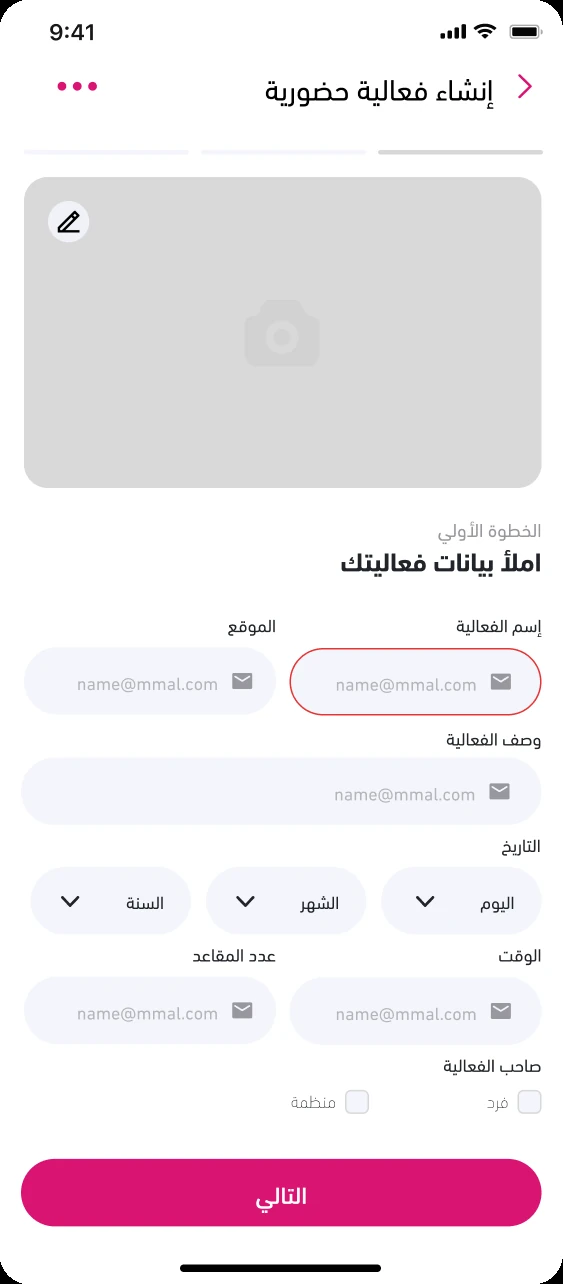
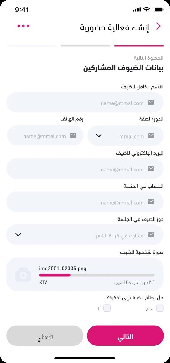
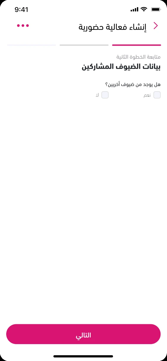
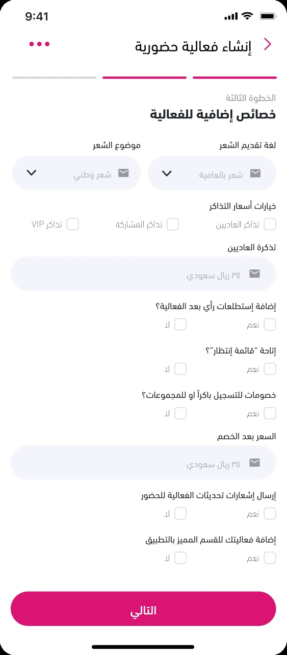
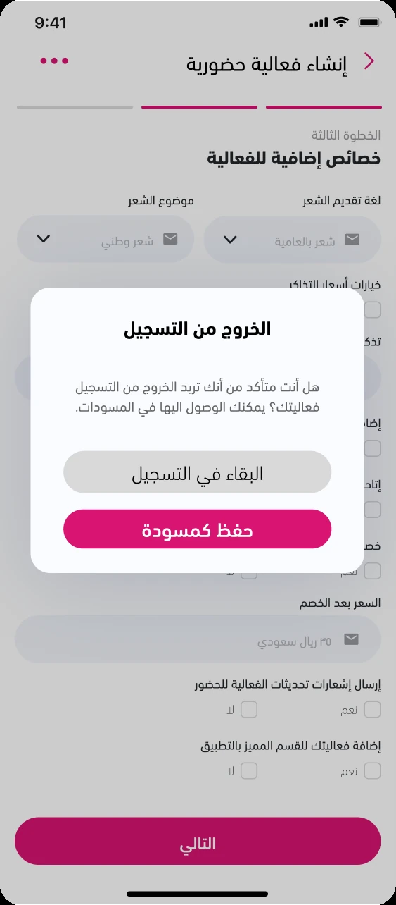
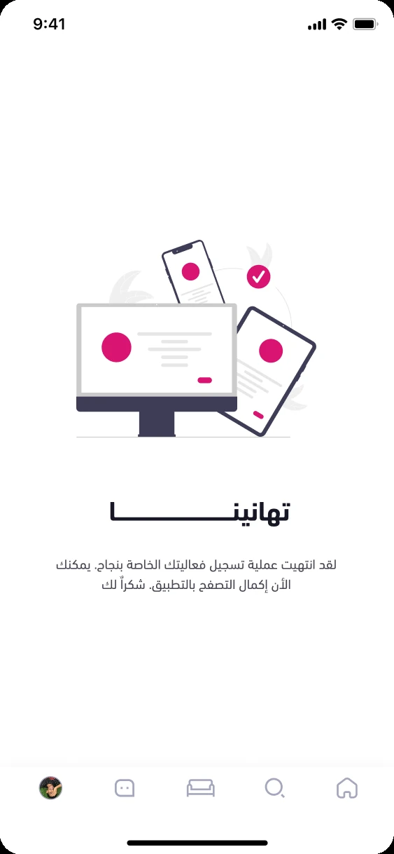
The half nobody asks for. An organiser filling in an event: four short steps rather than one long form, which is what makes the draft state worth having - you can stop at step two and come back to it.
What I decided
- RTL is not a mirrored layout. The stepper starts on the right, the carousel scrolls right to left, and prices are set in Eastern-Arabic numerals - three things that have to agree, or the screen reads as translated rather than designed.
- Ticket tiers are a comparison, not a list. Three die-cut cards side by side, each carrying what it includes, so the reason to upgrade is visible without tapping into anything.
- The detail screen leads with painted artwork rather than a photograph, because these are literary salons and stock photography would have made them look like conferences.
What I'd fix
I audited these afterwards and found two things. White on the yellow VIP ticket measures 1.49:1 - nowhere near AA, on the tier I most wanted people to buy; it needs near-black text. And the numerals don't agree with themselves: the price reads ٣٠ while the engagement counts underneath read 234. Both are mine.